Changing an icon without changing the icon
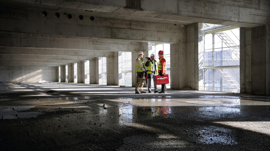
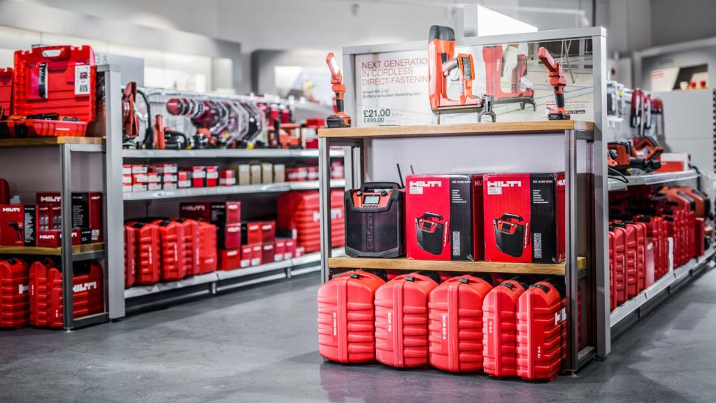
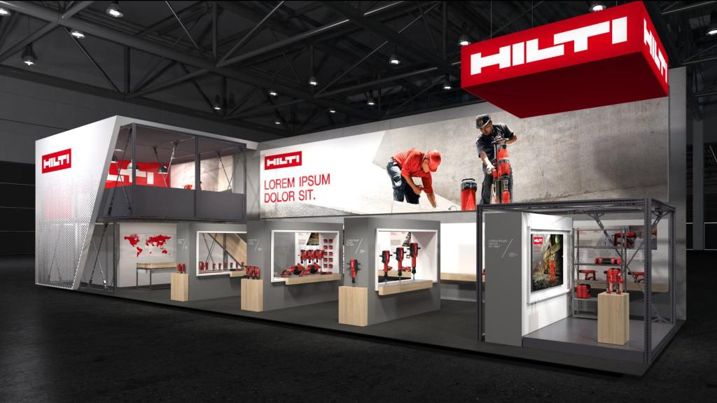
A red tool box at a construction site – that's definitely Hilti. You don't mess around with icons like this one. And yet we were able to make it a bit more modern and accessible.
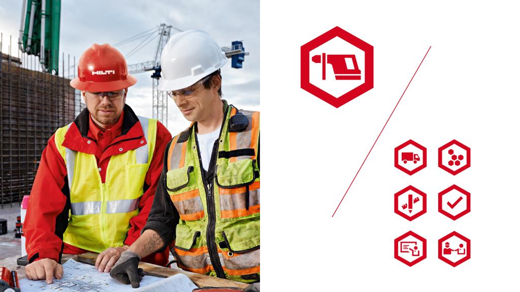
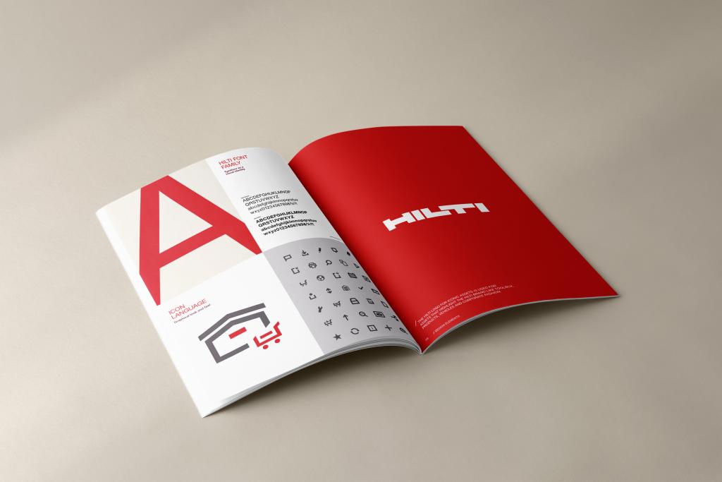
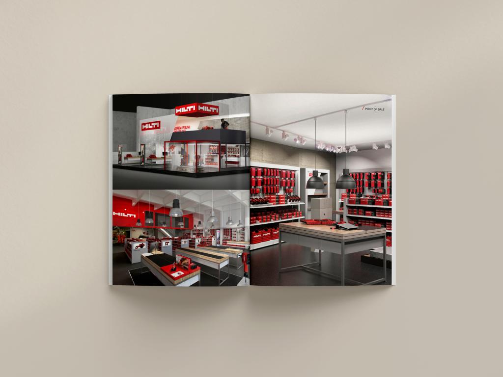
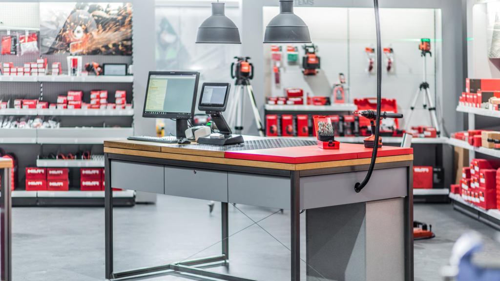
The logo remains virtually unchanged, but has been optimized for use in digital media. For all other elements of the corporate design, the following applies: less technology, more humanity! Because two thirds of Hilti's employees work in customer service. We put the focus on their honest consulting expertise: with warmer colors, an authentic visual style and statements that get straight to the point.
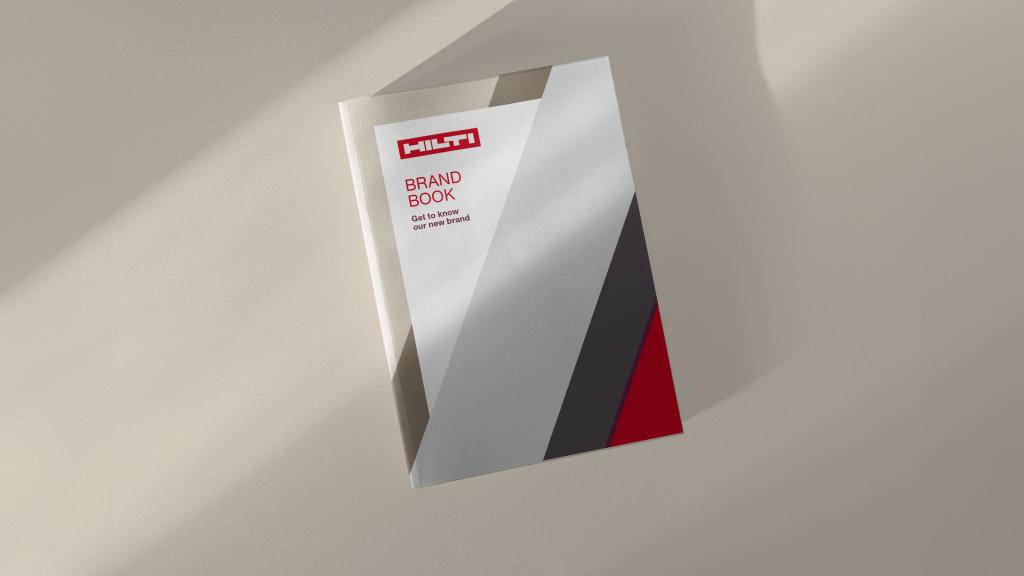
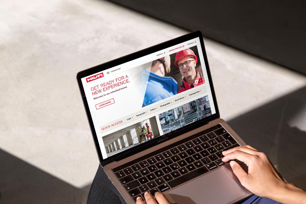
All assets for the brand change were integrated into an easy-to-use brand portal: this is not only aimed at brand users, but also raises awareness of the new corporate strategy among all 27,000 employees worldwide.
Norbert
Executive Creative Director
Swenja
Director Consulting
Next up
AirPlus
Making complexity smart and simple


