85 in one fell swoop:
Decathlon's new look
Sporting goods manufacturer and retailer Decathlon has 1750 stores, 85 brands, and finally a logo to unite it all. It makes sense, says Norbert. But there's still a lot of work to be done.
85 in one fell swoop:
Decathlon's new look
Sporting goods manufacturer and retailer Decathlon has 1750 stores, 85 brands, and finally a logo to unite it all. It makes sense, says Norbert. But there's still a lot of work to be done.
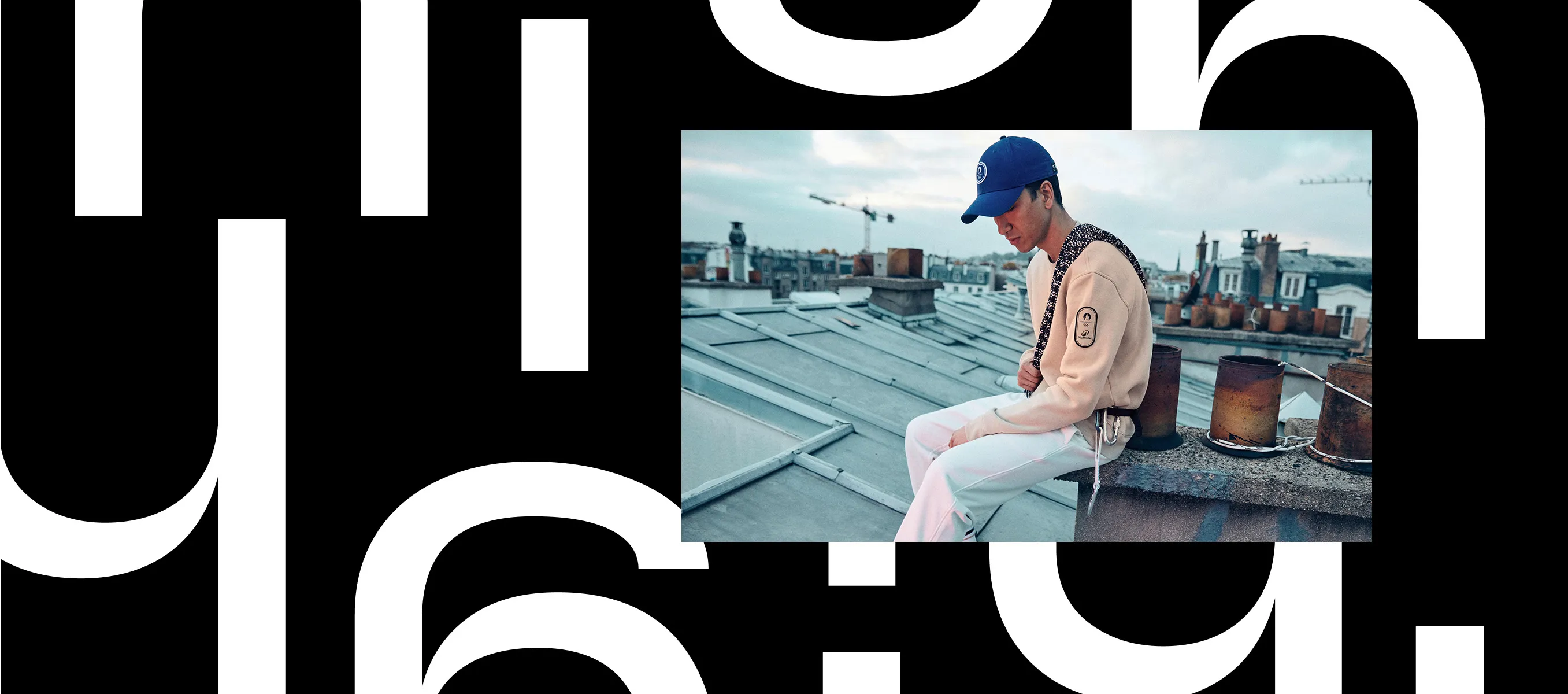
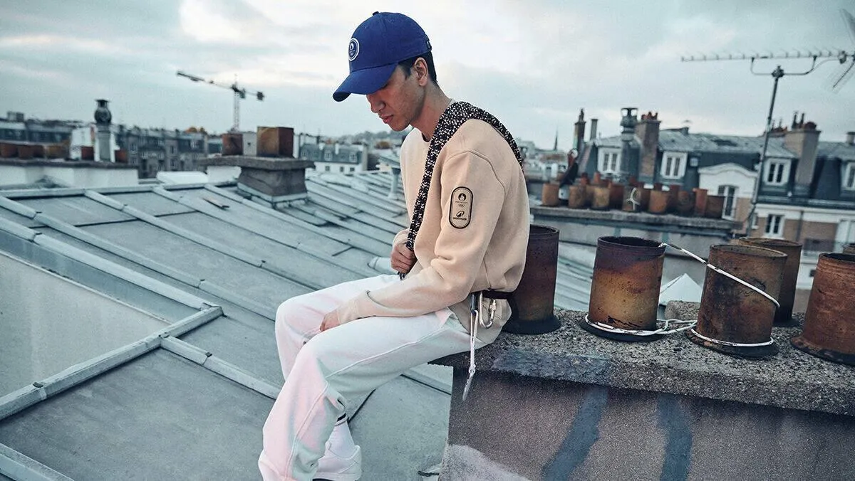
There are a few little routines in my life that I wouldn't want to do without. For example, going for a run around the Alster to clear my head. On weekends I run longer distances along the Elbe, sometimes the full marathon distance. So I would say that I have a certain enthusiasm for running. That's why I pay close attention to the brand of my shoes – not only because of their appearance (yes, I love my On running shoes), but above all because their fit and cushioning suit my running style. As for clothes, I don't care what I wear as long as it's black and doesn't have a huge logo across the chest. That's exactly why I go to Decathlon from time to time. There I can find running clothes that fit well, do the job, and are affordable as any I might find at a discounter. They come from the store's own brands Kiprun and Kalenji, and I take them from the pragmatically designed shelves, put them in a shopping basket, and pay for them at the self-service checkout – a process I would not describe as a “shopping experience.” At Decathlon, everything simply fulfils its purpose.
How big is Decathlon? I never gave it any thought until a few weeks ago. But when I stumbled across the new brand identity developed for the company by the Wolff Olins agency, I learned that Decathlon was founded in 1976, is active in 60 countries, has about 1750 stores employing more than 100,000 people, and generates annual revenue of about 15 billion euros. That makes it one of the world's largest producers and sellers of sports articles. I was quite surprised!
Of course, this success is due not only to passionate runners like myself, but to the fact that Decathlon has something for everyone who engages in any form of physical activity. The menu of sports to choose from on the website covers the entire alphabet, from angling, badminton, and camping to tennis, winter sports, and yoga. There is apparel, but also sports gear and equipment – and it is all branded with some more-or-less cryptic-sounding brand. There's Quechua for camping equipment; soccer jerseys come from Kipsta and racing bikes from Van Rysel; if you play table tennis, you can buy a Pongori table and paddles. The portfolio includes a wild assortment of brands and doesn't seem to follow any recognizable system. But that has never bothered me, because it's pretty typical for discount retailers.
There's a total of 85 in-house brands. All of them aesthetically reflect their respective market segments, and the Decathlon brand doesn't appear on any of the products. Against this backdrop, it is initially surprising that Decathlon is adding a logo to its range that can be embroidered on clothing and printed on equipment. Who is in charge here, consumers may wonder. Is this product from Kiprun or Decathlon? And why do two different house brands have the same logo on them?
Reason enough to take a closer look at the new design. Yes, even the lettering has been changed (but not necessarily improved), the blue is more vibrant (but hardly printable anymore), and there is a new font. However, the big change in the design is the so-called Orbit: an open oval whose outline forms an upward-pointing tip inside. While the oval is intended to express the company's commitment to recycling management, the opening stands for accessibility. The tip not only points upwards, it also echoes the curve of the CA ligature in the wordmark. And somehow we are supposed to recognize a “D” as well. So while the symbol aspires to express quite a lot, overall it seems pretty generic. But let's be honest: if we hadn't learned it over decades, we would probably find the Nike swoosh rather arbitrary too.
Precisely because the Orbit appears somewhat generic, it suits the image of a discount brand.
I actually had nothing to criticize about Decathlon's previous appearance. It seemed very functional an appropriate – blocky lettering and medium blue as a corporate color. Decathlon took a back seat and didn't feel the need to become an iconic brand like Aldi or Lidl, who often sell seasonal clothing adorned with large logos. But now it looks like Decathlon wants to become a lifestyle brand. In addition to its visual appearance, the company plans to redesign its stores and introduce digital tools customers can use to meet up for sports activities. Sports brands like Nike and Adidas have had similar offerings for a long time. The effort required for Decathlon to catch up must be immense.
Does the new look go with these changes? I think so. Precisely because the Orbit appears somewhat generic, it suits the image of a discount brand. The symbol uses the design codes of the sports and leisure segment, but at the same time seems natural and unobtrusive. The in-house brands will now be relevant for categorizing the extensive range, and probably will appear less and less on the products.
The Orbit also works well in digital touchpoints. The oval is styled to look like an icon, and the upward arrow lends itself to animation. Content on the screen is placed in a way that creates spatial impressions – whether it's overlapping image motifs, dot matrices, or information tiles that can be rotated and flipped through with a swipe. That affords plenty of potential to create more intuitive shopping experiences with enhanced emotional appeal. And a visit to the current Decathlon website demonstrates that that is something the brand sorely needs. The plethora of products and brands has proliferated to the point of confusion, and the various country-specific websites have made different attempts to organize content and make everything more comprehensible for users. So Decathlon still has some work ahead of it. But to use a sports metaphor, rebranding efforts are usually marathons, not sprints. Let's hope they don't get muscle cramps while running the next few kilometers. And let's hope I can finally learn how to spell “Decathlon” correctly.
The latest contributions exclusively on W&V:
This design column by Norbert has been published on W&V online. As a W&V member, you will also find the latest articles from his series there.
Meet the author
Norbert
Executive Creative Director
PETER SCHMIDT GROUP