You forgive your best buddy
for changing their style
PayPal, the online payment service, has a new brand identity. Norbert finds the applications appealing at first sight, but on closer examination suspects they risk becoming interchangeable.
You forgive your best buddy
for changing their style
PayPal, the online payment service, has a new brand identity. Norbert finds the applications appealing at first sight, but on closer examination suspects they risk becoming interchangeable.
Last week I went to see my physical therapist Axel again. In the many hours I have spent with him, I've probably told him most of my life story. Once in a while I share anecdotes about my work. For example, that I recently attended an event to celebrate the anniversary of the Deutsche Bank logo. And that the Deutsche Bank logo – designed more than 50 years ago by the famous designer Anton Stankowski – is an iconic design that is known around the world. Axel said he couldn't imagine why. The logo is not very creative, after all. A square with a diagonal line through it.
His assessment did not dissuade me from my own judgement. But it did get me thinking: His view of design work is clearly very different from the way our profession sees itself. Why practice reduction when it's possible (figuratively speaking) to draw anything in the world? Why use a simple line instead of a smiling piggy bank? Sometimes conversations with people from outside our field can be very eye-opening. It made me wonder whether what inspires us creatives is equally well received by outsiders.
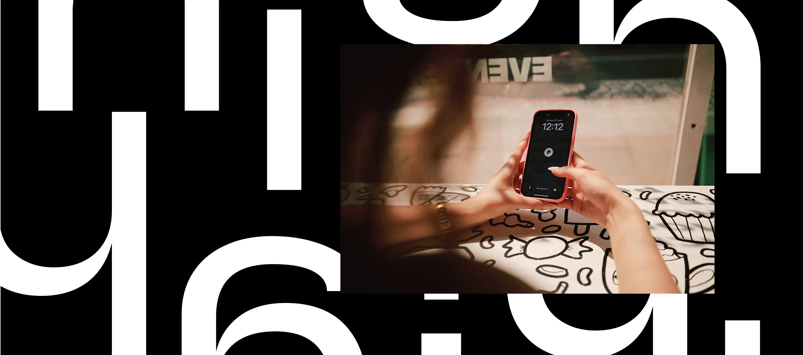
I regret that I neglected to ask Axel his opinion of PayPal's new visual identity. But there will probably be plenty of opportunities for me to do that, as the new look is currently only visible on the various designer blogs and hasn't been rolled out to the general public yet. I guess he'll notice it soon enough, because I'm pretty sure he uses PayPal. After all, it's a global payment service with about 400 million customers around the world. Many of them value it as a safe payment option for online purchases, especially if they don't have a credit card or don't want to disclose their credit card details. The PayPal brand stands for security and is known as a convenient way to transfer small amounts of money – for example, when you go out to dinner with friends and split the bill. Or when – and this happens to me all the time – a colleague is celebrating their birthday or an anniversary. When that happens, we use PayPal to take up a collection within the agency, sending our contributions to a PayPal account. Like the name says, it's an easy way to pay a pal.
I don't want to dwell on my fantasy of my physical therapist's opinion of the new PayPal brand identity, but I rather suspect the very typographical, reduced approach that Pentagram has developed won't have him jumping for joy.
Personally I must admit that when a digital company with such a high level of penetration changes its appearance, I usually just shrug. Meh, whatever. They're already so well established that they're not going to win or lose any customers as a result. The name is still the same, and whether the wordmark is italicized or not doesn't really make any difference. As long as the app is still recognizable, everything will be fine.
On the other hand, though, banks and financial service providers are all about trust, and changes of any kind can unsettle people. So I think it's good that the italic double P trademark is still here, along with the app icon – slightly sharpened, and with a modified shade of blue, but still a familiar symbol. To me, the fact this symbol could be read as an abbreviation for the wordmark was always one of the best features of PayPal's branding.
Where does the branding end and the content begin? You can't tell anymore.
But that association has been lost as a result of the redesign. PayPal not only decided to adopt an in-house typeface, it uses the same font both for headlines and its wordmark. Where does the branding end and the actual content begin? You can't tell anymore. But hold on – aren't designers always insisting that a corporate typeface with a strong character is an essential brand element? Yes, that's true, but then the typeface has to be a very good match for the brand, and not look like a Futura clone. Instead of a stand-alone font with personality and independence, you get one-size-fits-all indifference. In today's era of fake news and knock-offs, it's unseemly to confuse people with undistinctive, interchangeable typography.
The design itself is appealing; at first glance it looks very elegant. The application illustrations look striking, the headlines are amusing, and the mock-ups show ideal-typical uses that will never exist in real life. Even on social media applications, PayPal doesn't use the symbol as an identifier; everything is typographical, reduced to the point of geekiness. A cool case study, but with no real relevance to the brand.
Does that mean I will use PayPal less often? Nope. And my therapist Axel surely won't either. Ultimately we'll probably end up agreeing that the design doesn't matter as long as the payment process stays as convenient and uncomplicated as it already is. We still won't see eye-to-eye on the Deutsche Bank logo. But in light of this PayPal redesign, the quality of a symbol that hasn't changed for 50 years and doesn't even need a wordmark to be recognizable is all the more striking.
The latest contributions exclusively on W&V:
This design column by Norbert has been published on W&V online. As a W&V member, you will also find the latest articles from his series there.
Meet the author
Norbert
Executive Creative Director
PETER SCHMIDT GROUP