Translating Swabian quality in three letters
Sustainable and ethical high-quality lingerie – that’s the family-run business from german Swabia for a hundred years. With the brand relaunch, their standards become visible.
Read more
In this way, we are establishing Mey in the premium segment as a matter of course.
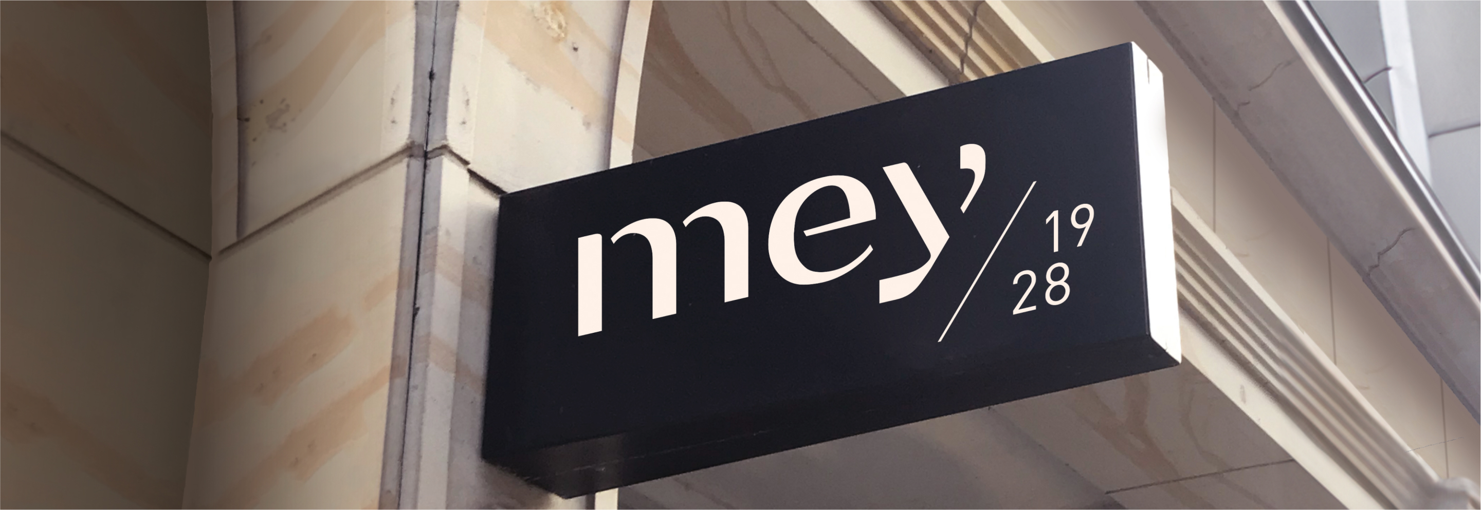
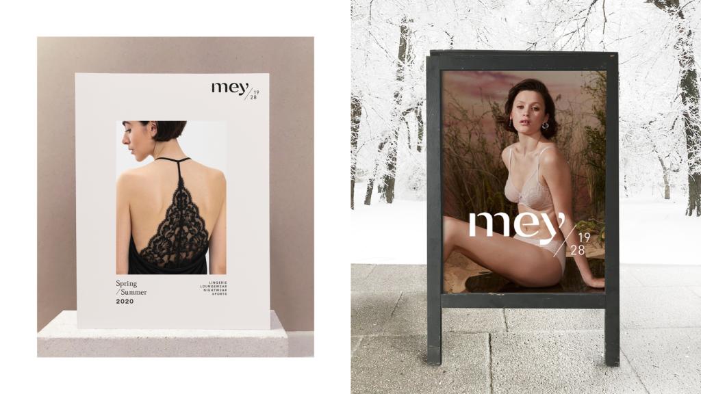
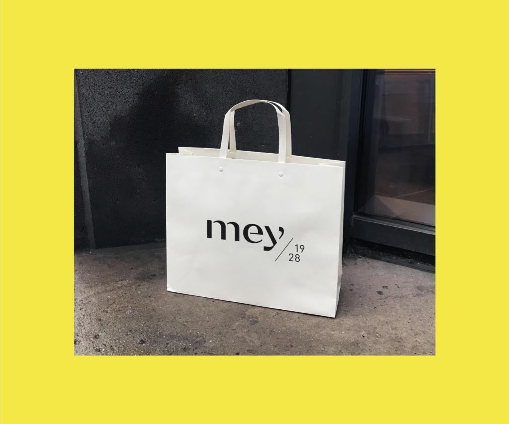
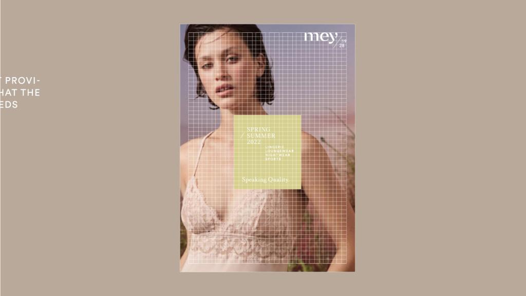
Centerpiece is the new logo. It is based on the brand’s proven craftsmanship; with the kind of gaps you would inevitably expect if the letters were embroidered onto fabric. It was only logical to add a mention of the company’s founding year 1928 – and a new tagline that expresses its mission: “Speaking Quality.” All of this shows a love of detail and subtlety. It is a radical break with the technical, stripped-back look of its predecessor.
Added to this is a system of flexible but strong icons: striking on accessories, adding value, increasing sales. From now on, Mey can use these symbols that create strong narratives, are multi-layered and recognizable and yet never become boring.
Lukas
CEO & Managing Partner
Next up
Triathlon Bundesliga
Giving triathlon four colors and new coolness


