Making complexity smart and simple
AirPlus is changing from a service provider for business travel management to an all-round partner with simple payment solutions. A shift that is now visible in the brand identity.
Corporate payment expert AirPlus International is much more than a partner for business travel accounting. Its products and services simplify the often complex processes surrounding the payment, accounting, analysis and monitoring of corporate expenses. Some 53,000 companies around the world take advantage of AirPlus' comprehensive service for the entire procurement process.
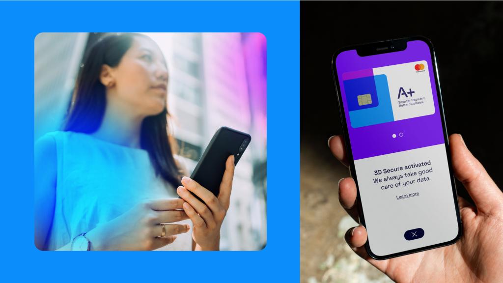
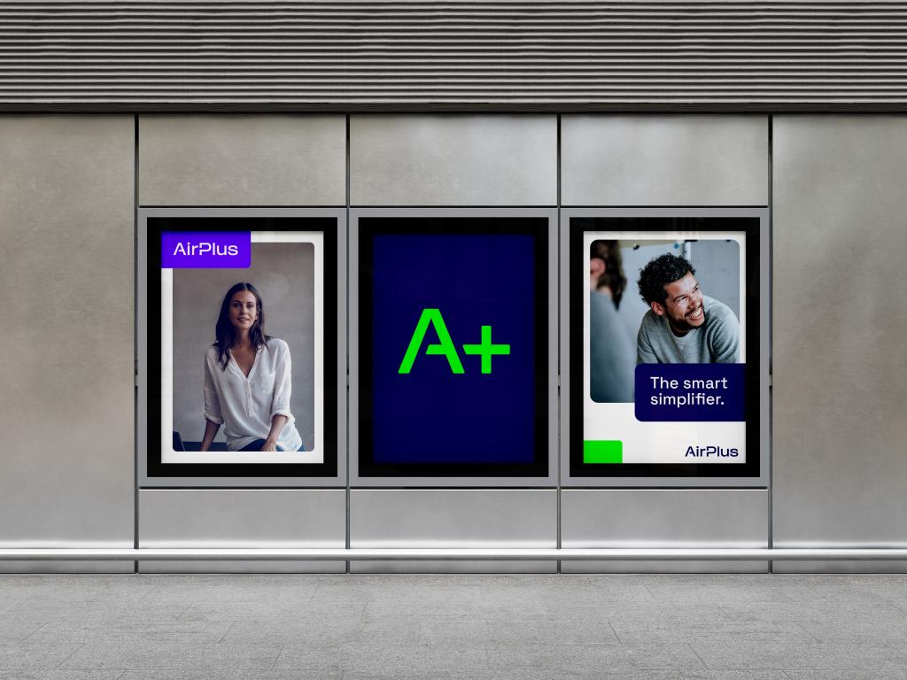
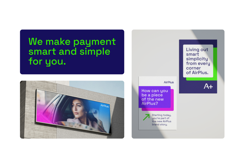
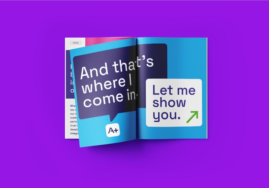
In order to reflect this customer benefit more clearly, AirPlus commissioned Peter Schmidt Group to update its brand identity. The agency developed an emphatically digital look with convenient user interfaces that allow for maximum flexibility of use. The redesign retains strong brand assets like the AirPlus name and the trustworthy dark blue of the previous visual identity, and enhances their impact by combining them with energetic colors. Translucent layers overlap to achieve a bright appearance. The logo has also been redesigned, with the previous serif typeface being replaced by a modern, unambiguous font that corresponds to the rounded corners of the colorful graphic elements.
The redesign itself was preceded by an in-depth strategic analysis and a positioning process also supported by Peter Schmidt Group. From the outset, an extraordinarily broad base of AirPlus employees were involved, with more than 360 of them participating in ideation sessions and surveys, because the aim was to develop a brand identity that employees could identify with.



Felix
Executive Creative Director

Dominik
Design Director
Next up
Infomotion
Enthusiasm for data, made visible by design


