Which elements do you consider sacrosanct, and where have you consciously made room for new impulses? In other words, how much variation can the Telekom brand tolerate without losing its consistency?
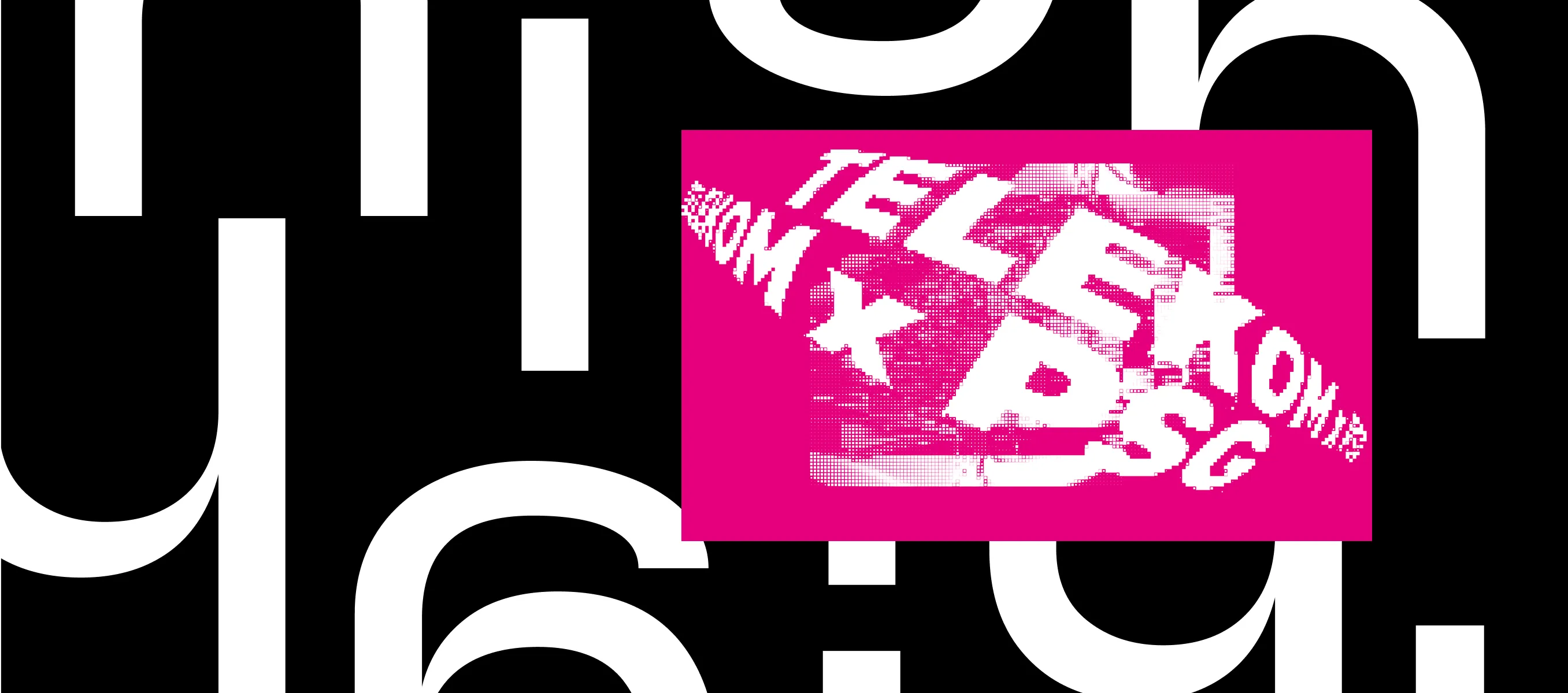
AE: A good brand design must be able to adapt to the current situation, new media, and emerging technologies. Digital environments place complex demands on the visual identity and require contextual freedom rather than rigid rules. It's a matter of finding the right balance between fixed and variable design elements. In our case, a lot depends on the correct use of the brand color. If magenta is not just decoration but a consistent, formative element of the brand identity, I can't go far wrong.
LC: When we started our work, one thing was obvious to us: The elements of the Telekom brand are very well defined for the current strategic context. The use of the logo, brand color, and typography are all clearly defined. Everything else, like for example imagery, illustration style, headline treatment, patterns and shapes – all that is flexible and can be adapted to the communicative message.
AE: Right. The T, the color magenta, the acoustic logo, and the corporate font “TeleNeo” are the constants in our brand identity. They have been specifically developed over the years to guarantee reliable recognition and are non-negotiable. All the other elements can be used freely in line with a few basic design principles.