Kitzbühel's new look: 
History melts away like snow

Natural beauty and cultural heritage no longer have a place in the new brand identity for Kitzbühel. Norbert thinks the city is neglecting its greatest asset and becoming an interchangeable event location, all for no good reason. 

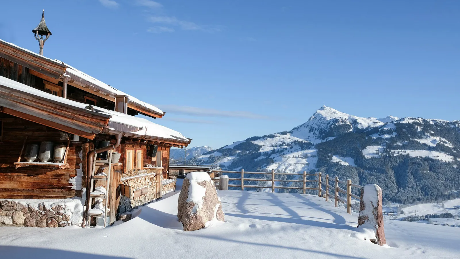
As a native of northern Germany, I really don't know if I have any right to pass judgement on the visual appearance of an Austrian resort town. On the other hand, I may be part of their target group. Hamburg has an astonishingly large ski club, and the winter holidays lure many folks to the Alps. Even I have been to Kitzbühel before. It's been a few years, unfortunately, but I still remember the city's logo. I found the dancing letters a bit too frivolous, but the symbol with a goat standing on a boulder was omnipresent, not only in the hotel and the city's literature, but all over town as well. And with good reason: The chamois goat-antelope appears in the city's coat of arms and was designed as a distinctive symbol by a painter named Alfons Walde in 1933. Not exactly a year people like to refer to, but still: How many logos and symbols are there today that have lasted for nearly 100 years? Exactly! 


Further research reveals a great deal about Alfons Walde, He was a distinctly joie de vivre artist from Kitzbühel, actually an architect, who liked to throw parties and who painted both landscapes and nudes – which somehow fits the cliché of a chic holiday resort. He also designed the station buildings for the Hahnenkammbahn cable car, and in his capacity as Kitzbühel's cultural advisor, created the logo as well as a baroque color code for the city's buildings. His paintings of the landscape and rural life were also effectively marketed as postcards and posters. From today's perspective, he would be called a marketing genius.


Disney-fying a vacation area

But now the chamois designed by Walde is a thing of the past. So is the logo, and for that matter the entire history. Because now there's a new brand identity, that has been presented in a three-minute film. After seeing it, I had to catch my breath. It only takes five seconds to grasp the concept, and strictly speaking, there's not much design to speak of: A red surface, a new logo with a simplified goat outline above a wordmark, and more animated sans-serif typography than you can shake a ski pole at. Underscored by a booming bassline, with a voice shouting “Like that!” and stuffed with mockups and lifestyle aesthetics, the whole thing seems over the top, like a conglomeration of clichés. The Disney-fication of an entire vacation region.  

Kitzbühel should have taken a closer look at its stylistic treasures.

This impression is apparently totally unintended, since a press release from the tourism association that commissioned the brand identity describes it like this: “The new corporate identity for Kitzbühel is designed to look like a fashion brand and marks a paradigm shift in the identity of a destination brand. Kitzbühel is the very first destination to move away from representations of natural beauty and adopt a stylized, artificial design.” What an affront! A place known for centuries as a holiday resort – famous for its impressive Alpine landscape, with the Kitzbühel Horn the and Hahnenkamm and the storied Streif downhill slope – no longer considers its natural wonders essential to its identity. Just let that sink in for a moment.  


I also find the parallels to the 2022 relaunch of the Hugo Boss fashion brand rather noteworthy – including the strikingly similar brand film. It's no wonder, given that both were created by the same agency. It doesn't take much imagination to guess what the tourism association asked for: “Something like what you did for Boss – that's what we want for Kitzbühel too!” The target groups probably even overlap. But while fashion-brand aesthetics are a perfect match for a fashion brand, they miss the point for a holiday resort.

Luxury needs uniqueness

Maybe people in Kitzbühel were bored with their own story, having told it so many times. Or they decided with alarm that it was no longer working and went into a panic – it's worth mentioning that they recorded a whopping 16% decline in overnight stays in 2023. And yet the place still has an impressive history. Kitzbühel has had a town charter since 1271, and the famous Stanglwirt Inn dates back to the year 1609. The first Hahnenkamm race on the Streif slope in took place in 1931, the same year the aforementioned design by Alfons Walde was introduced. All this is precisely the kind of history other places long for! It's a tale that has something magical about it, something intangible, that people are happy to pay a premium for. It's the kind of story you should be prominently emphasizing if you want to appeal to an affluent clientele, as Kitzbühel does. Without a doubt, even great stories have to be told differently in 2024 than ten years ago. The previous brand identity didn't live up to the city's premium aspirations. But the right response is not to melt away their unique identity like snow in the off-season. 


A few weeks ago at the Swiss Brand Convention in Zurich I caught a presentation about the new brand identity of the Swiss Tourism Association. It doesn't postulate a paradigm shift, but it moved me nonetheless. It also communicated important topics such as nature conservation and sustainability that cannot be conveyed with the trendy appearance of Kitzbühel's design. Moreover, I learned from that lecture that Switzerland is being inundated with tourists, and guests from Asia and the USA were willing to pay nearly any price. The brand appearance of another luxury ski resort, St. Moritz, is an example of how this positioning can be conveyed in a sophisticated and stylish way. They're still using the traditional wordmark and sun logo that also originated in the 1930s, but presenting them in a new, contemporary context.

Wasted potential

In my opinion, Kitzbühel should have taken a closer look at the stylistic treasures in its repertoire. A typeface with a strong character could be developed from Alfons Walde’s lettering, to celebrate the quirkiness of the letters as a headline font, in line with current trends. A color scheme could be defined from the facades of the city's buildings. And even if you don't have the courage for all that, a small caption saying “Since 1271” would have been better than nothing. 


Instead, Kitzbühel remains aseptic and polemical. The new appearance could just as easily represent Ischgl. Or Las Vegas. Or a shopping mall. It is interchangeable, artificially constructed both in terms of strategy and creativity. “If you want to reach people's hearts, what you do must come from your heart.” I recently read that Goethe's famous motto is also the guiding principle of Maria Hauser, who is responsible for marketing at Stanglwirt. How true! I wish that the values of the residents had been taken into account when developing the Kitzbühel brand identity, instead of an artificial positioning as a “preferred place to be.”  


The latest contributions exclusively on W&V: 

This design column by Norbert has been published on W&V online. As a W&V member, you will also find the latest articles from his series there.

Meet the author

Norbert
Executive Creative Director

Mail to Norbert