Why Jaguar might win you over 
upon closer consideration

Jaguar has received a lot of criticism for its new brand identity. Norbert thinks we should take a moment to appreciate to brand's courage instead of simply dismissing the new approach out of hand.

I don't know how many times in the past few years I've been handed a briefing from a brand that wanted a “disruptive” design. And every time I wonder whether they really mean it. After all, a “disruption” is more than a new coat of paint. Disruption involves destroying everything and creating something entirely new. And that means questioning the very foundations of your business. 


For a few days now, car lovers and the design and marketing scene have been in a flurry of excitement, after British luxury carmaker Jaguar took a step that is disruptive in every respect. A radical “reset to zero.” Typography, logo, colors – everything that has characterized the brand identity up to now – have been discarded, simultaneously with the erasure of all of the brand's Instagram posts. And the change is not just cosmetic. It's a reflection of the brand's fresh start. Jaguar has discontinued the production of combustion engines; the last models will be phased out before the end of the year. Jaguar does not yet have anything new to offer. In 2025 dealerships will have to bridge the gap by selling used cars and providing customer service.


A brand, but no products yet

This leads to the paradoxical situation of a brand presenting its new design before we know anything about the new product. Under these conditions one can't really presume to make any serious evaluations about the brand identity. And yet the commentaries are never-ending – and most of them are negative. But even bad PR is PR, and as a result of the hail of criticism, curiosity about the presentation of the first prototype is increasing. It will take place on 2 December at Miami Art Week, which is around two weeks after the brand relaunch. One thing is already clear: Jaguar knows how to build suspense! 

 A step that is disruptive in every respect.

But let's get back to the design. In the press release sent out by Jaguar, it is broken down and explained in more detail than I have ever seen before. Its thematic focus is “Copy Nothing,” which is a reference to the company's founder Sir William Lyons. The brand character is derived from this principle, and aims to attract attention through “fearless creativity” and express itself in “exuberant modernism.” Carefully crafted neologisms, to be sure, but I'm still not impressed. 


The new visual appearance is based on four elements: The brand signature comprising a wordmark and a monogram, a set of stripes, a new color pallet, and the “leaper” – the pouncing jaguar that people are probably most likely to associate with the brand at this point. In the communication around the relaunch, however, it is the last element to be mentioned. While it is referred to as a “precious mark of provenance,” it remains unclear what role the leaper will play – especially on the products themselves.

Functional and fashionable

The other brand elements, on the other hand, are featured prominently. From now on the “Jaguar” wordmark is a set of geometrically shaped, mixed-case letters that at least make a reasonably harmonious visual impression. I find the forced independence here remarkable, and a marked contrast to some other brand developments. The mixture of upper- and lower-case letters means there are no descenders or ascenders, which is very advantageous when it comes to placing the wordmark on the product. Another design trick is how the capital J and the small r mirror each other to frame the wordmark. The two letterforms are also combined to create a monogram that I immediately associated with a fashion label. I can well imagine it being used on accessories. This impression is certainly reinforced by the accompanying images Jaguar has created. There's none of the shiny chrome that was common for carmaker logos years ago, and no glow, like they often use to signify electric vehicles today. Instead, just a gold silhouette of the kind you might expect to see on a belt buckle or a pair of sunglasses. And isn't a car a kind of accessory for some people? 


But Jaguar didn't just derive a monogram from the wordmark, it also created a new corporate typeface – which incidentally goes unmentioned in the press release. The typeface does use ascenders and descenders, which immediately sets it apart from the wordmark and also improves legibility. I don't like a few of the typographical details, but it doesn't matter – the house font at least enables brand-characteristic messaging in the many image-heavy motifs and teaser videos currently circulating on the internet.

The second brand element is a linear graphic called a “strikethrough.” Some of the images show it as a detail with an integrated pouncing jaguar, while others suggest slats on a vehicle. I must admit I find this element neither unique nor independent, but it does hold potential. “Strikethrough” can also mean “cross out,” and I like the connotation of “otherness” it contains.


A fresh start with niche art


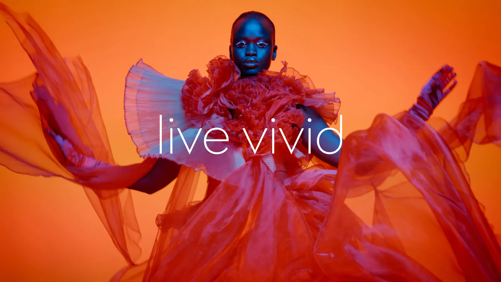
That leaves one remaining brand element, the color pallet. Jaguar is moving away from understatement and its traditional “British Racing Green,” and the new look is uncharacteristically vibrant. Yellow, red, and blue are meant to conjure up associations with the art world, and Jaguar combines these same primary colors to mix up bright oranges and delicate pinks that are used in the campaign motifs for abstract or minimalistic spaces as well as flamboyant pieces of clothing. Again, this awakens associations with a fashion brand, and the effect is somewhat feminine. Looking back at how the brand presented itself as recently as the 1980s – a plethora of clichés including a pipe-smoking English gentleman – this is really an enormous and in fact disruptive step. The vehicle presentation at Miami Art Week fits in which this – not at a car show, not at CES in Las Vegas, but at an art event. 


Jaguar has also announced further collaborations with creative artists. If we disregard everything we thought we knew about the Jaguar brand and see the new look through the eyes of the new target groups that are meeting it for the first time, we can speculate about which market niches Jaguar might be able to attract. It will be fascinating to watch, not just in Europe but in Asian markets as well, where Audi also made a surprise move a few weeks ago when it decided not to use its four-ring logo on electric vehicles. A symbol that stands for 90 years of brand heritage is suddenly relegated to the "old days" of the combustion engine. It's ballast that has to be thrown overboard because only the "new" is valid in the new marketplace. That's why I think instead of fundamentally criticizing this relaunch, we should celebrate the brand's courage to be disruptive, and be curious about its next steps. For my part, I've marked December 2nd in my calendar and hope that at Miami Art Week, Jaguar will not only present a vehicle but also surprise us (again) with a spectacular performance.  


The latest contributions exclusively on W&V: 

This design column by Norbert has been published on W&V online. As a W&V member, you will also find the latest articles from his series there.

Meet the author

Norbert
Executive Creative Director

Mail to Norbert